In recent years, great web design has become increasingly paramount to success. Web design can be an invaluable marketing ally, from improving SEO to making that stellar first impression. Humans are distinctly visual creatures, so this development was likely inevitable. This we have explored before, but this time we may delve into a core component of modern digital marketing success. Namely, colour psychology and web design, from what feelings each colour inspires to where and why it may see applications.
So, without further ado, let’s begin.
The psychology of colours and why it matters
First, let’s briefly define the term we’ll be using and establish why it matters in our context.
Colour psychology refers to the study of colours as determinants of human behaviour. It holds that different colours inspire different feelings and can thus alter human psychology and behaviour.
This concept is far from new; ancient Egyptians employed it, seemingly for therapeutic purposes. In the 20th century, Carl Jung asserted that “colours are the mother tongue of the subconscious,” exploring it as a psychotherapy tool. Today, the principle finds applications in business premises to inspire productivity and reduce stress, drug addiction therapy facilities, and even our daily lives.
In digital marketing, too, colour psychology finds multiple uses as an enticing tool – which data supports. Among other findings, Neil Patel notes the following:
- 92.6% of people say the visual dimension is their primary purchase determinant
- People make subconscious judgments about products within 90 seconds of viewing – and 90% of said judgments are based on colour alone
- Full-colour ads enjoy a 26% higher recognition rate than black-and-white ads
These and other findings confirm that colour psychology directly affects audience perceptions of websites, products, or brands themselves. It is here where colour psychology and web design begin to overlap, as experienced web designers have noticed.
Applying colour psychology to web design
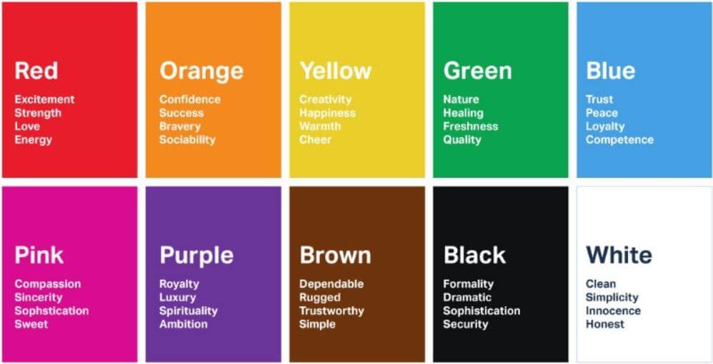
Many articles on this subject will choose to explore every colour’s connotation with that context in mind. That would be simple enough to do, but we feel basic infographics like the above suffice.
Instead, we would like to explore two distinct questions that colour psychology presents; where it applies and what should inform it. Starting with the former, consider the three primary examples that follow.
#1 Logos
In most regards, logos are visual manifestations of a brand’s identity. They inform first impressions, spearhead brand recognition, and prime audiences for specific brand experiences.
One should absolutely mind the colours here. Creating a perfect logo does expand into other elements, of course, such as:
- Shapes and geometry
- Copy and taglines
- Intended brand image
Therefore, one’s logo generally requires meticulous design. But colour is the first element audiences will process, as the data above also shows. Simple colour contrast may make all the difference between appeal and indifference, and colour choices alone carry immense significance.
#2 Home pages
In much the same way, home pages will often constitute the first impression of a potential customer with a brand. Thus, the primary place where colour psychology and web design meet is arguably the home page itself.
SEO-fueled backlinks to specific, relevant content may present an exception here, but consider how many first touchpoints lead to one’s home page:
- Social media links
- Google Business Profile (formerly Google My Business) links
- Home page backlinks
- Branded search results
- Navigational search results
Once audiences reach one’s home page, how its design and colours guide the eye to individual sections and information is just as crucial as the first subconscious assessment that colour themes will provoke.
Web design also has to mind loading speeds as it caters to first impressions, often needing to reconcile the two. This we have covered before, should you need to explore that angle of web design.
#3 Landing pages
Finally, colour psychology also directly enhances landing pages and informs their effectiveness. It distinctly overlaps with Landing Page Optimisation (LPO) and Conversion Rate Optimisation (CRO) beyond web design itself.
In this regard, colour does not simply inform trustworthiness or inspire desirable actions. It also directly enhances landing pages themselves, through such means as:
- CTA optimisations. Some CTA colours work better; for example, HubSpot found that red beats green by a considerable margin.
- Readability enhancements. Simple colour contrasts, be they on CTA copy or elsewhere, can directly enhance readability – and thus help inspire trust and positivity.
- Branding consistency. Should colour choices remain consistent across the customer journey, they can also help denote professionalism and provide a solid experience.
Landing pages also hinge on other elements beyond colour psychology and web design, such as copy and formatting, CTA placement, etc. However, colour psychology arguably precedes them all and thus requires due attention.
Informing colour psychology in web design
Finally, here we may explore the second question; which colours should one opt for? This question often gets simple answers, such as choosing colours that allegedly inspire desirable feelings.
However, the truth of the matter is far more complex, and it will be relevant whether one hires web designers or opts for DIY. Colour choices need to account for other factors, which we may consolidate down to the following 3.
#1 Your industry
First, one’s industry plays a significant role as regards colour. This is simply because different industries cater to different audiences, as we’ll cover next. Each industry has its own established palette, which should offer a safe starting point before considering experimentation.
For example, the healthcare industry may opt for blue to signal safety and calmness – as Pfizer does. Electronics firms may prefer black or white, like Apple, to denote serious professionalism, while restaurants may pick an exciting red like Mcdonald’s.
Should you need more such examples for inspiration, VisualCapitalist offers a handy infographic.
#2 Your audiences
Second, and somewhat connected to the above, colour psychology and web design often need to cater to specific, unique audiences. This is why there are no universally applicable solutions or blueprints to success, but only guidelines like these.
To address this, brands may consult their audience analytics to have them inform their course. Consider such audience differences as:
- Gender. While both sexes like blue and green, men prefer black, and women prefer purple. In addition, men strongly dislike purple, while women dislike grey and don’t quite love black.
- Age. Similarly, younger audiences will often prefer exciting colours like red and orange. In contrast, older audiences may prefer a serene green or blue or a serious black.
- Location. Finally, different locations come with varying connotations of colour. For example, consider the Red Oni and Blue Oni trope traditionally found in Japan; these connotations will not translate to all cultures identically.
Naturally, different brands will target drastically different audiences, making such distinctions extremely substantive.
#3 Your brand image
Third and lastly, one’s established brand image is also a crucial factor. Brand consistency is undeniably vital to marketing, which will often have to limit colour choices further.
This factor overlaps with the above as well and culminates into a simple question; what is the intended brand image being conveyed?
Exciting audiences with a bright red hue may seem appealing, but it won’t work for brands that otherwise present themselves as sophisticated and calm. A professional black may not work for healthcare products, and an inspiring green may clash with a quirky, social media-savvy presence like that of Wendy’s.
In all such cases, the intended effect on psychology needs to align with one’s established or intended brand image. Anything less and the customer experience may become disjointed, doing more harm than good.
Conclusion
To summarise, colour psychology and web design synergise to inspire specific, desirable feelings. This concept finds applications wherever web design does, from logos and home pages to landing pages and more.
However, it is no simple principle to apply, and colour choices need to account for an array of factors beyond austere colour connotations. Hopefully, this exploration helped you note some of the most crucial ones among them and provided some inspiration for your future web design endeavours.


0 Comments